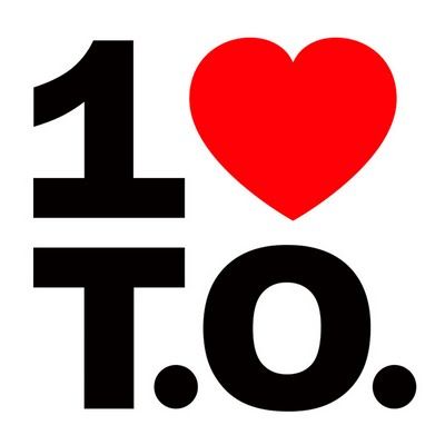
Toronto, Canada is often known as "a world in one city". This summer an initiative launched that took this statement to the next level: 1loveTO. The logo is a thing of beauty (no bias from this Toronto native), but on first glance, this may remind you of something you've seen before:


Aside from the fresh new font, there are two very profound differences between the Toronto logo, on the left, and the New York City logo, on the right. These differences enable the Toronto logo to be a unique statement on its identity, rather than a cheap "knockoff" - these same principles can apply to your brand.
1) Speak to your unique identity
Just a minor brush stroke on the first character is all that differentiates them, but look deeper and you'll see the identities of each city emerge. "I love New York" is an individual statement of one's affinity for the city, but changing the "I" to a "1" showcases out the authentic nature of Toronto's sense of community and inclusiveness. Not to go too far here, but I think this also extends each country's philosophy: the American "melting pot" and the Canadian "cultural mosaic".
Please understand, I'm not making a value judgment on either city, instead pointing out how the real nature of what makes each country and city great able to uniquely shine through with just a subtle functional difference.
2) Increase accessibility to your brand
Taking a page from MTV and Google's book, the 1 Love T.O. logo encourages a playfulness by enabling its identity to morph to adapt to the various cultures in Toronto - further reinforcing its identity. The standard way of thinking about logos is that they are static and meant to encourage recall through repetition. Instead, this logo takes the bold stance of encouraging recall through relevance through adapting it through contextual variants. For Toronto's Caribana festival this summer, which celebrates Toronto's Caribbean population, the 1LoveTO team developed a set of accessible versions of their logo by incorporating the respective flags of each country:

So not only should you let your logo take a stand and reflect your unique identity, but also relinquish your need to control it completely and and in turn make it accessible to a larger audience. You'll find that making it understandable and accessible can be a powerful combination, as exhibited by 1loveTO.


